Livskraft
Uncovering a wellness brand’s natural beauty
For a skincare and wellness brand looking to rebrand to suit their roots and philosophy, stripping back to the bare, raw essential ingredients breathed new life into every aspect of their new brand identity.
-
An existing skincare and wellness brand needed a new name, logo, and visual identity to reflect its philosophy of purity, self-care, and connection to nature, while honoring the founder’s Nordic heritage and focus on holistic health.
-
Stripped-back design highlights nature’s power.
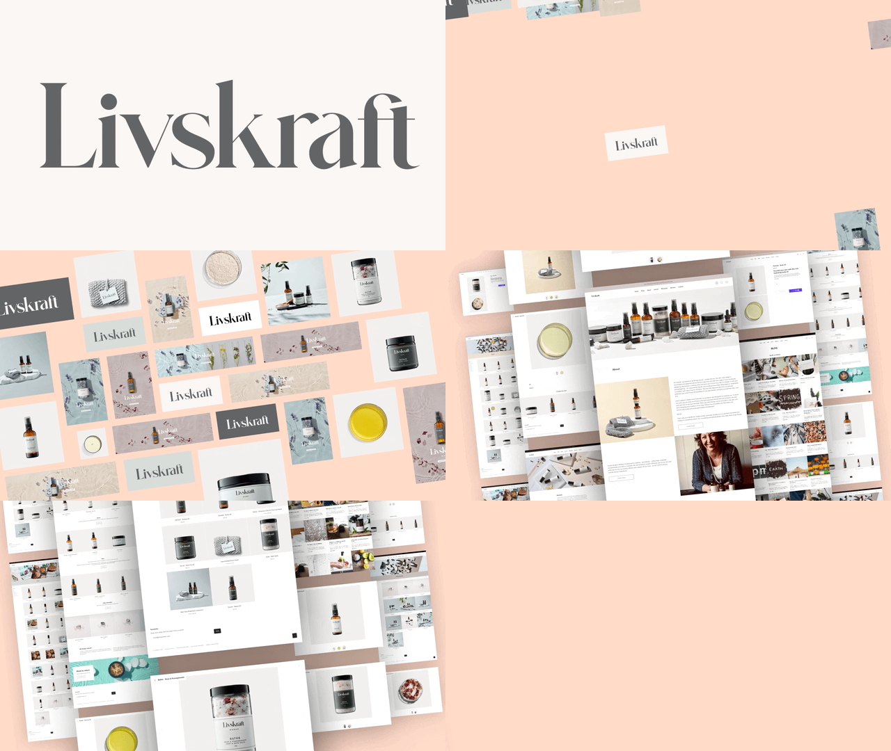
Inspired by mid-century Scandi design, we crafted a minimalistic and contemporary brand aesthetic, blending Nordic and local origins. The muted, natural color palette, stripped-back textures, and botanical imagery emphasize the brand’s natural ingredients. Clean, contemporary fonts were chosen to ensure the products look great both online and at home.
-
The name ‘Livskraft’ means ‘life-force’ and evokes holistic wellbeing, craftsmanship and a natural way of life, with a nod to the brand’s Nordic roots.
The design aesthetic is stripped back to basics to showcase the essential elements. The colour palette is muted and naturalistic. Design elements are used to portray simplicity, purity of purpose and clean lines.


